Test Run from Karl Lawson on Vimeo.
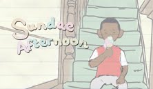
This is an online journal of the progress and pitfalls of my latest film, "Sundae Afternoon".
Monday 16 May 2011
SLooooooooooooooooooooooooooooow Down
Quite worried that the pace of the film is still too fast. What do you think. Feedback much appreciated as I need this (near) perfect by Friday morning!
Thursday 12 May 2011
The hills are alive, with the sound of music
Today we got to meet the students from the RCM who will be potentially composing pieces for our films. Have to say that they were a really talented bunch. Did spend some of the presentation time with Han discussing who's music suited each animator, with the class agreeing unanimously with subtle nods that one of them is perfect for Emma.
At the moment I'm working towards the rough-cut deadline of next Friday at 10am. Fiddling about with some shots and angles. Main concern is that the timing will still be too fast and now the RCM are involved there's a pressure not to let them down by screwing around with your timing, so has to be airtight!
Wish me luck.
Monday 9 May 2011
Problem!
Something that's just been going through my mind is that several people watching the film end up feeling quite sorry for the boy. People are reading into the story that the dad is neglecting the child rather than the dad being tired having just got in from work (or something to that effect). Are there any shortcuts to establish a relationship that makes the dad look more caring and overworked than lazy? Also, are there more ways of making this kid less likeable without changing his physique (so, no suggestions for make him fatter)
Ideally, not looking for a major overhaul but will take all opinions into consideration.
Solutions/Comments below,
Thanks.
Ideally, not looking for a major overhaul but will take all opinions into consideration.
Solutions/Comments below,
Thanks.
Thursday 5 May 2011
Changing Rooms
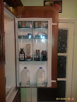
I decided that in order to keep my set constant and to get a homely feel, I needed to both research living spaces, and create my own in its entirety, rather than shots here and there. However, given the lack of time at my disposal this had to be quite a quick process, so no time for Maya modelling. I decided to start with the fridge, as it's one of my favourite shots from the animatic, but I soon realised that I don't know what a fridge door looks like, as I'm usually just grabbing isolated items. I had a look on a few images from websites but decided first hand experience would be best, so I looked at both the fridge in Back Hill and at home, and did a quick sketch or two. Hopefully this comes across in the animation.


What I did next was take photographs of similar locations in my own house that appear in my film, so the staircase, the living room and the hallway. I tried to get a focus on the smaller items that make a place feel more homely, e.g. embarrassing photographs from one's childhood, pot pourri and staircase spindles.
 Ikea's Finest
I after taking these images I went about drawing each wall of the set from the opposite side of the room, until I had all four sides of the lounge. I instantly saw flaws in the positioning of certain items from both the perspective of the film, and common sense. I then annotated on the scans of the images.
Here are my initial sticking points:
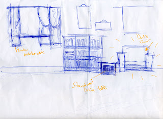
This is the wall you will see in the film, and probably the one shown most throughout. Naturally, I had a strong idea of the main positions here. The window had to be far enough from the dad's chair to mean the boy has less chance of waking up his dad. What I've noticed is that it may need to be bigger as it is the main window in the living room so I may have to adjust the height as the width needs to be somewhat narrow. The little table is just to rest things on so you get an idea that it is part of the dad. Resting say, a mug, or a newspaper on there as part of a routine. I may remove the wall hangings as it could look a bit cluttered.

This is the wall that leads to the kitchen. I liked the idea of an open archway leading into the kitchen. I think this makes the idea of the sound travelling from the window to the kitchen and the boy hearing it a bit more believable. Due to later realisation, which I will get on to, I would probably have to move the sofa closer to the CD rack, and even move the arch a bit more to the left as well. I like the how the wall doesn't seem very busy but it doesn't look bare.

This the wall that I'd given the least thought to prior to drawing it, but most of the action happens over here. The table is where the dad first walks to, off-screen. He will put down his keys and wallet then amble to his armchair. I'm not sure of the design of the table yet but I'm reasonable happy with how this one looks.

Here is the main issue for me. There needs to be a door where the lamp is to lead to the hallway/staircase so that the kid has two exit points in the room. The walls look ridiculously empty. I don't want there to be a massive HD television on the wall, primarily because I originally wanted this set in the late nineties. I guess I'll need to canvas some more opinion and research to fix it but it seems to be the odd one out in terms of final positioning.

More stuff soon.
Later.
Tuesday 3 May 2011
Shimmy Shimmy Quarter Turn
Here are the aforementioned model sheet drawings. I figured the best way to show these was both in picture form, but couldn't find a way to keep the grids and guides to stay on a n exported image, so I've exported this to a .mov file and here are the results. I did do a bit of research on this for proportionality, and according to my research a 10 year old is roughly ¾ adult height, hence why the grids would have been nice to have.
What do people think about the colours, particularly with the father's attire. I'm slightly concerned about over-saturation. (Comment and let me know!)
My next post should be the layout stuff, so stay tuned.
What do people think about the colours, particularly with the father's attire. I'm slightly concerned about over-saturation. (Comment and let me know!)
My next post should be the layout stuff, so stay tuned.
Model Sheets from Karl Lawson on Vimeo.
Subscribe to:
Posts (Atom)